SaaS Dashboard Redesign (Complex Data Simplification)
Client
Freelance concept
Role
UX Designer
Duration
5 Months
Year
2026
Context
A B2B SaaS platform showcased a robust dashboard, but many users expressed that it was overwhelming and intimidating.
Problem statement:
Too much data density, poor hierarchy, and lack of actionable insights.
My Role
As the Lead UX Designer, I am tasked with restructuring the information architecture and redesigning the user interface. My focus is on improving the overall user experience by ensuring that the layout is intuitive and the navigation is seamless. I aim to create a visually appealing interface that enhances usability and meets user needs effectively.
Process
- Conducted heuristic evaluation and usability testing
- Grouped metrics into logical clusters (Performance, Revenue, Users)
- Introduced modular card-based dashboard system
- Added personalization (drag & reorder widgets)
- Improved visual hierarchy with spacing and typography system
Outcomes
- 1. Reduced cognitive load significantly (user feedback improvement)
- 2. Increased daily active usage of dashboard features
- 3. Faster decision-making reported by users
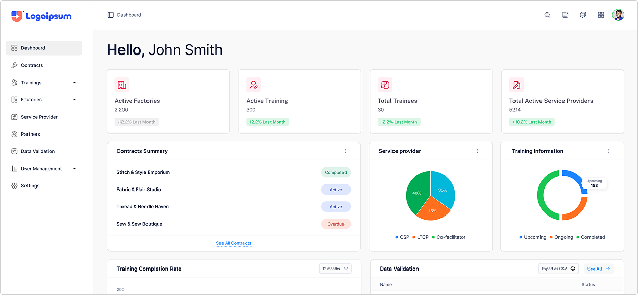
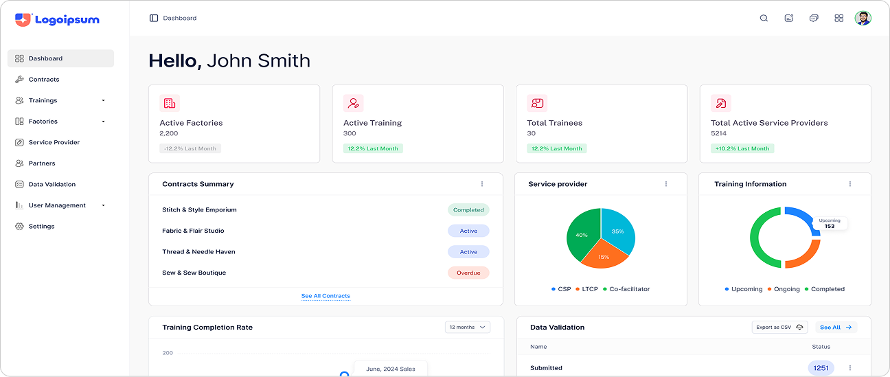
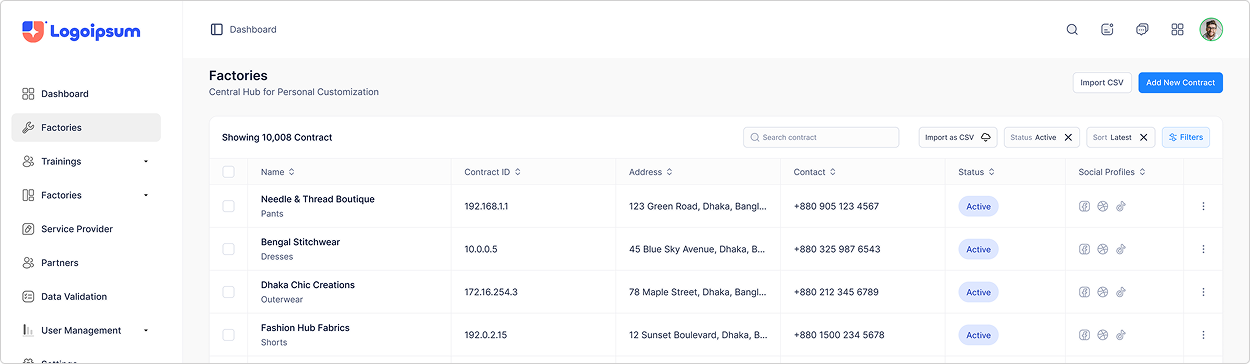
Screenshooots-1
Screenshooots-2
With an ‘Add new widget’ button a new metric widget can be added to a dashboard. A widget drawer is opened by clicking this button and an admin can select the widget that they want to see on any particular dashboard.
This is the widgets drawer in which all the widgets are present. The widgets in the drawer are categorized according to the features they present the metrics of.
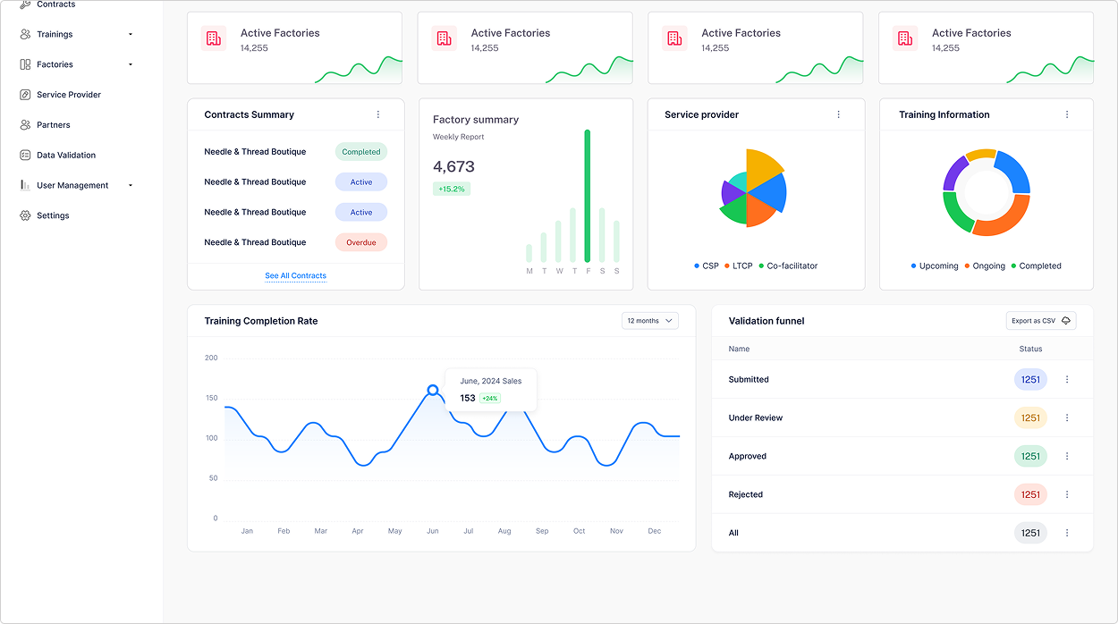
The quick updates menu is where an admin can keep an eye on the user activities and manage them from a single widget. The menu is scalable, meaning more tabs can be added for the admin to switch between to manage different areas. The admin can toggle between hide and unhide this menu to access more space and view another widget (metrics) on the dashboard.